
klondike & smokey city
Crime and Safety Statistics
If you are having trouble viewing the data dashboards, please try refreshing the page.
The Fundamentals
The prevalence of disruptive and dangerous criminal activity, especially violent crime, is one of the most important problems that residents face every day. When children are exposed to violence in their community, the psychological impact hurts their academic performance even if they and their families are not directly harmed.
Taking action to improve neighborhood safety is crucial, but it must be done with care and caution. The more we understand about where and when different types of crime occur within the neighborhood, the better we will be able to take actions and support programs that will help address the impact of crime on residents as well as the root causes that lead to criminal behaviors.
Klondike and Smokey City at a Glance
The essential facts of criminal incidents recorded by the Memphis Police Department, such as the type of crime, approximate location, and time of day, are a matter of public record and can be accessed at the Public Safety page of the Memphis City Data Hub. All of the information that follows on this page regarding crime in Klondike and Smokey City comes from this source unless otherwise noted. Please be aware that the MPD only releases information on offenses committed by adults; juvenile crime records are subject to extra privacy protections and are not included in our dashboards.
Compared to the city as a whole, on a per capita basis the residents of Klondike and Smokey City experience twice as many criminal incidents, two and a half times as many violent crimes, and over three times as many homicides in their neighborhood annually.


“Violent” incidents include Assaults, Kidnappings, and Homicides.

The number of homicides per year in Klondike and Smokey City is a single-digit total, so the values are more volatile year to year.
If we look at the number of incidents that occur in each hour of the day, it is evident that only at breakfast time can neighborhood residents step out of their door and expect that the danger to their lives and property will be roughly comparable to what the average Memphian has to deal with. At all other times, the threat is far higher.

All population estimates for the above graphs are taken from the US Census Bureau.
Taking a Closer Look
Since criminal activity is accessible to us on an incident-by-incident basis, we can easily dig into the data to compare different types of activity, pick out trends over time and space, and understand patterns. Our interactive dashboards give you the opportunity to focus on different crimes, times, and places, and answer more specific questions about what is going on in the neighborhood.
First, we have a more thorough accounting of the number of incidents, overall and by type, from January 2015 to the present. The slider bar (highlighted in yellow) will let you set the display to only show incidents from a more limited time period, and clicking on any of the categories on the left side of the dashboard will focus the graphs on incidents of that type.
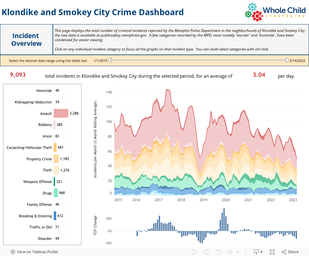
Both the monthly incident and year-over-year change graphs use three month rolling averages; in other words, the monthly incident total shown for December 2019 reflects the average value for October, November, and December 2019. This reduces “noise” and makes the graphic easier to follow.
Next, we present the same information, but this time slicing it up by month, day, and hour. For example, the incident count for the month of May in the first graphic is the total for every month of May in the selected date range; if the date slider is set to the full range, the graph will show you the sum of May 2015, May 2016, May 2017, and so forth, up to the current year. As with the overview dashboard above, you can click on an individual crime type to limit the display to only that category; you can also click on an individual month, day, or hour, and the other two incident cycle graphs will focus in the same manner. For example, if you click on the word “Sunday”, the monthly and hourly graphs will change to show the totals only for incidents occurring on a Sunday.
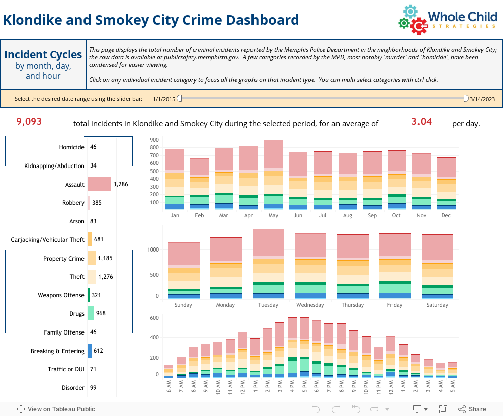
With this set of graphics, we can start to raise some interesting questions about patterns of activity for different seasons of the year, different days of the week, and different times of day, and how those patterns differ between various types of crime; a simple and well-known example can be seen if you view only assaults, which occur more frequently in summer (when people are out and about more, and aggravated by the heat).
Finally, we have a heat density map. Quite simply, the more intense the color of the red overlay, the greater the frequency of the selected crime type(s) in that area.
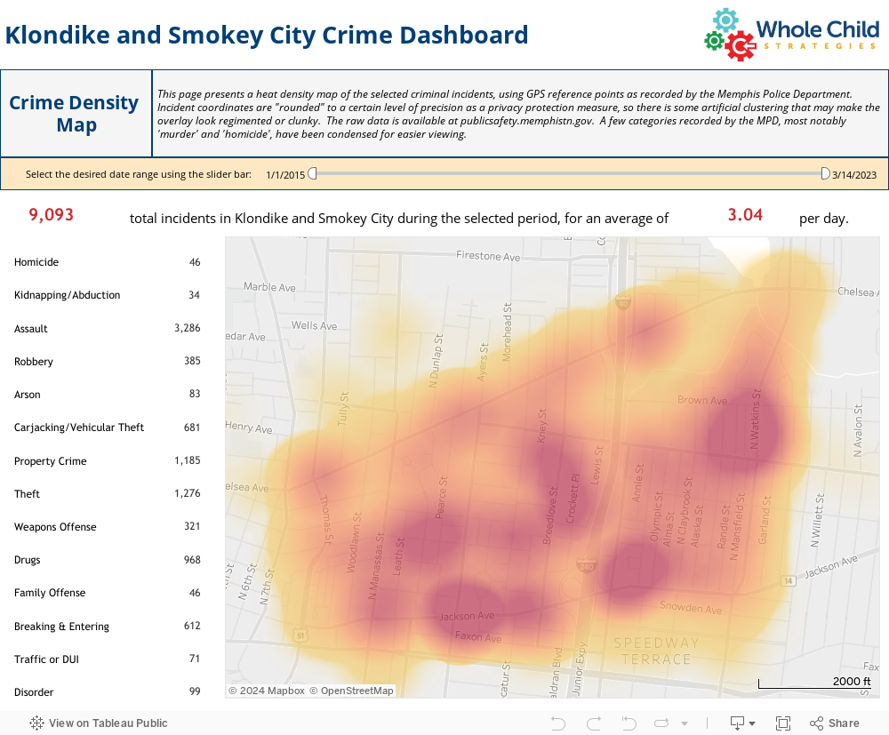
Here, too, it can be very instructive to compare patterns over different time periods and for different types of offenses. A good example can be seen if you view only drug offenses (by clicking on “Drugs” on the left hand side), and then set the date range slider A) to the first half of the time period covered (2015-2018), and then B) to the second half (2019-2021); note how one center of drug activity moves from the intersection of Jackson and Bellevue across I-40 to Breedlove Street, and how the volume of offenses in the vicinity of Dunlap and Looney drastically increases over time.
Let’s Talk About It
We believe that making information equally accessible to all members of the community is an important step toward effective conversations and programs that serve the actual needs of people in the neighborhood, and your feedback can help ensure that information is accessible to you. If you have suggestions for more information or analyses you would like to see on this topic, please drop us a line and let us know your thoughts!